
Split toning has become quite popular thanks to Adobe Lightroom making it easy for photographers to experiment and add duo-tone sepia and film effects to their photographs. But split toning isn’t anything new and actually dates back to the late 1800’s. The technique was used by photographers including Ansel Adams to add a colour to either the highlights or shadows to a black and white photograph (as they were at the time). Ansel would occasionally add a very subtle purple to the shadows of his stunning photographs.
Since the days of Ansel Adams using split toning the technique has evolved and we now use it slightly different to in the past. That’s not to say it can’t still be used like it traditionally was but as photography has evolved as have the way techniques are used. Photographers are now using split toning on the shadows and highlights of their images to recreate film effects like cross processing or adding a duo-tone like effect to their image. It’s a feature of Lightroom that I love to tinker with when editing my photographs and I’d been meaning to write a blog post about it for sometime now after making a YouTube tutorial on split toning last year.
What is split toning and how does it work?
Basically split toning involves adding a colour to either the shadows or highlights part of an image. One favourite of mine is adding a yellow to the highlights to give the image a warm feel. While other times I like to add a blue to the shadows to give the image a cold feel. If you’re going for a warm or cold look to your image this can sometimes be achieved by adjusting the temperature of the image. Personally, I prefer the control which split toning provides but you can also adjust the temperature for a similar effect
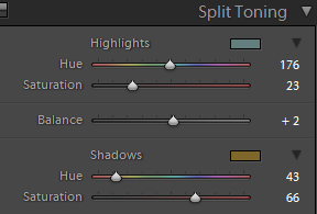
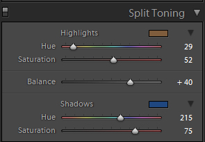
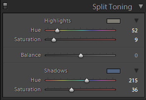
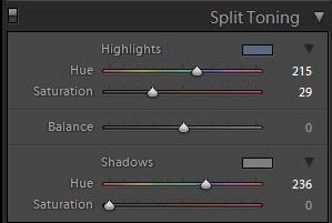
For photographers using Lightroom the split toning feature can be accessed by opening the Develop tab and located fifth menu down from the right. Once open you will be presented with two different options: Highlights and Shadows. Start by selecting the little box that appears next to Highlights and select the blue box (see below). Now do the same for the Shadows but this time select the yellow looking box.
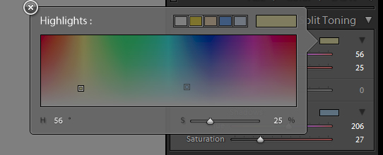
From this point I start to gradually change the hues of both the Highlights and Shadows, adjust the saturation of both and slightly play with the balance until at a level I’m happy with. There’s no perfect formula that will work all the time for images so I find the best thing to do is to play until you get the results you desire. If this isn’t making much sense then give my video split toning tutorial I uploaded to YouTube last year a look which explains the process better.
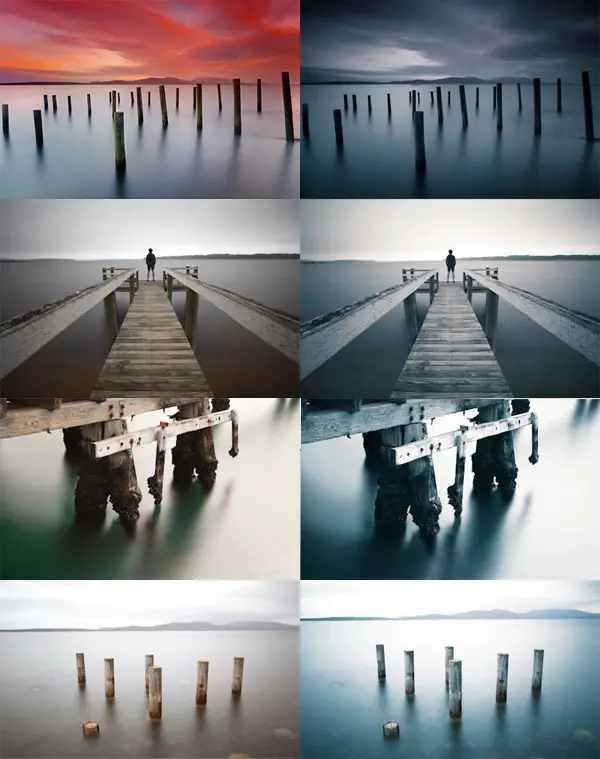
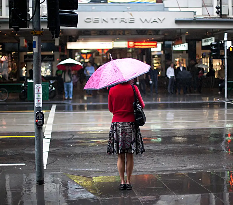
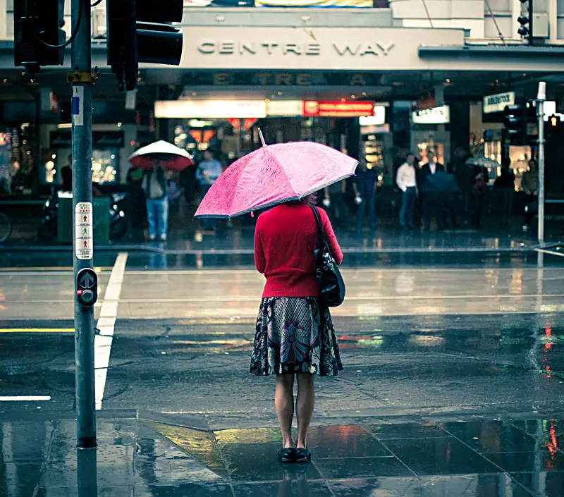
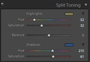
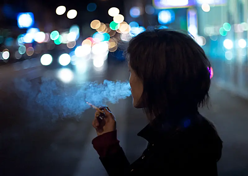
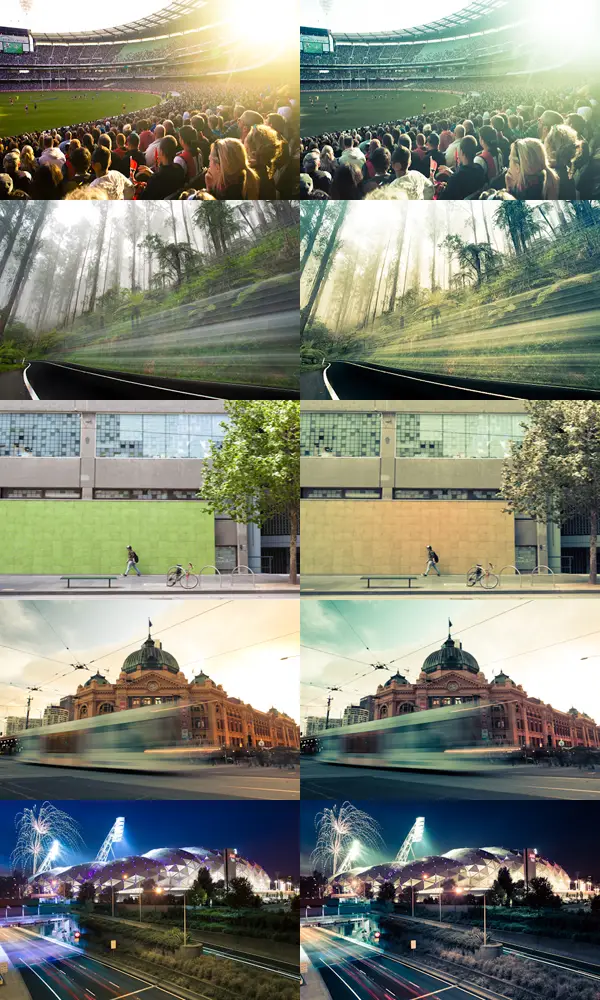
Let’s start to look at some images and the split toning settings that were used to give you an idea of how I’ve used split toning in the past –
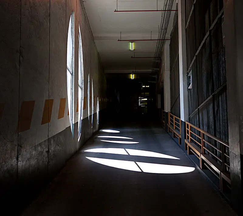
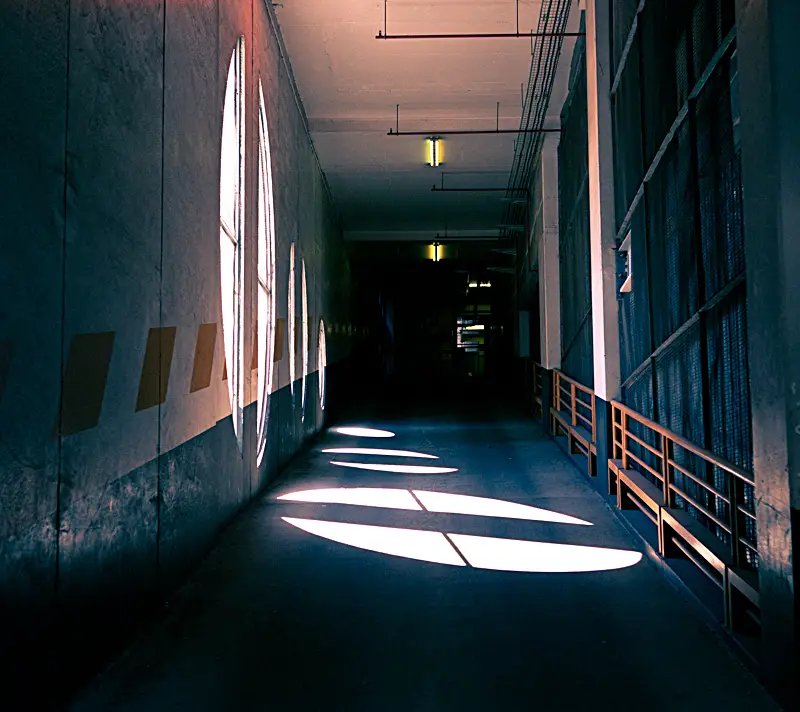
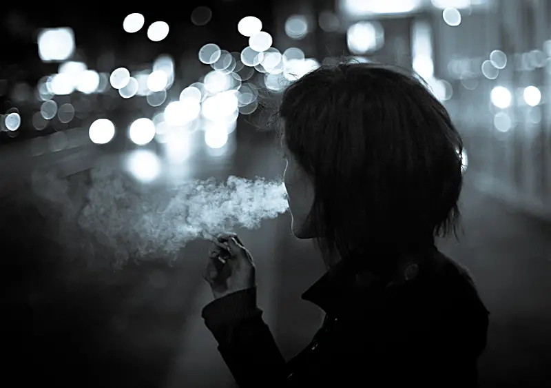
Adding Split Toning to Black and White Photographs
Another reason I love split toning is the subtle tones you can add to a black and white image. My favourite is adding either a very subtle blue into the highlights to almost give a duo tone feel to the image. For this image I processed as normal and then dropped the saturation completely to make the image black and white then opened the split toning and added a slight blue to the highlights. It’s a neat little trick and something I’ve got into a habit of adding when going for a black and white feel to my images but adding something a little different on top.
Split Toning Lightroom Presets
Or if you’re feeling slightly lazy and would rather all of this to happen at the click of the button then my Lightroom presets might suit you best. The presets (not to be confused with an Australian band…) are heavily split toning based and at this stage offer a duotone/cold effect and a coffee/warm effect for your images. Below gives you an idea of what the two presets offer.
Feel free to click either image to download the preset.
I hope this tutorial on split toning has been useful for you. If it has I’d appreciate you share the love by using one of the share buttons to the side menu on the right.
Feel free to drop an email if you have any questions. Always happy to help 🙂
– Alex

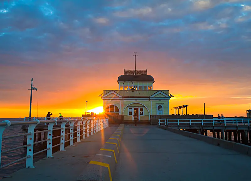
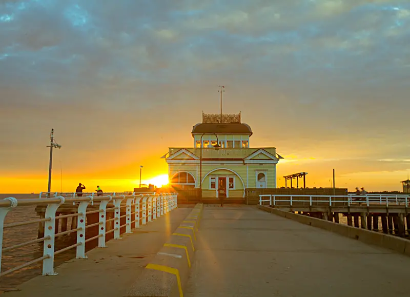
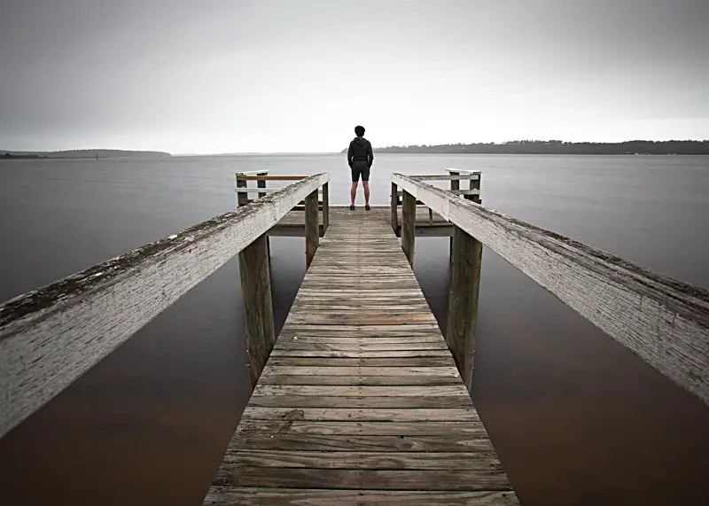
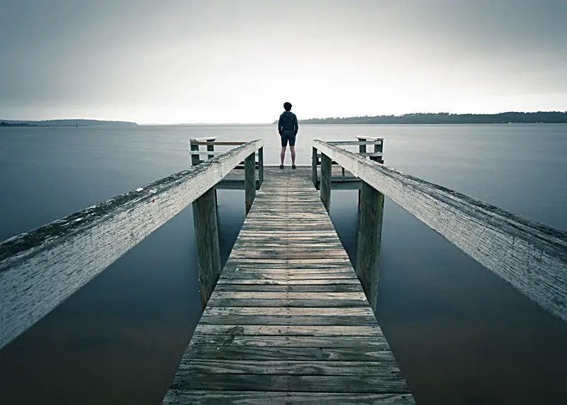
Nice article Alex, very helpful. Out of interest, where are is the wooden pier with the man at the end of it located? And also the the wooden stumps?
Cheers,
Charlie
Hi Charlie, apologies for the late reply! I only just saw this one sitting here. This location is actually at Rosebud Pier, quite a common fishing spot down that way so you shouldn’t have any issues finding it. Hope that helps! – Alex