Picked up a drone and still learning your way around Adobe Lightroom? Here are 6 of my Lightroom presets for drone photography to help get you started. These presets are best for drone seascape photography but can also be used for other types of drone photography. This quick guide includes tips on how to work the presets to suit your image, before and after images of the presets in action, download link for the Lightroom drone photography presets and finally, instructions on how to install these on your Windows or Mac.
Generally I find Lightroom presets best used as a base and then fine tuned to suit your image. For some images, my presets may make your image look over-done with the highlights or colours pushed too much. Don’t be alarmed! For this reason, I’d recommend setting a preset that you like and then adjusting:
- Tonal Curve – I generally use an ‘S Curve’ when editing my images which gives a strong shadow to your image while giving the highlights a pop. This may or may not work with your image so look to use the Tonal Curve section to adjust the Highlights, Lights, Darks and Shadows of your image.
- Hue Saturation and Luminance (HSL) – If the colours are too overpowering for your image, look to open the HSL section in Lightroom to decrease the strength of the Hue, Saturation and Luminance of the preset.
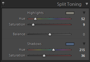
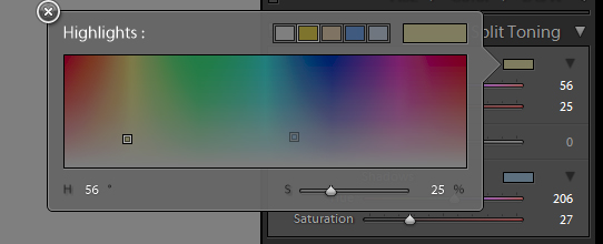
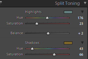
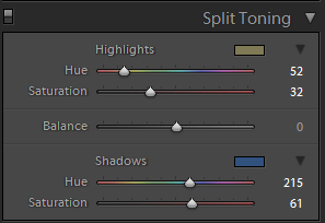
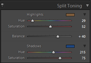
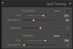
- Split Toning – This is where the real magic happens. Use the Split Toning section to either decrease or increase the strength of the split toning to the Highlights or Shadows of your image. It’s also worth playing around with the balance of the split toning where you may want the shadow split toning to be more overpowering than the highlight split toning.
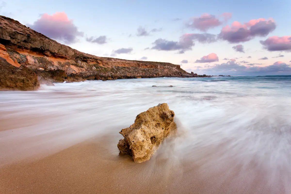
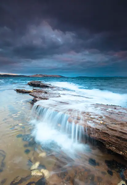
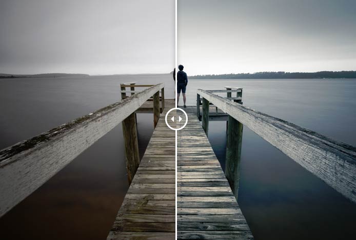
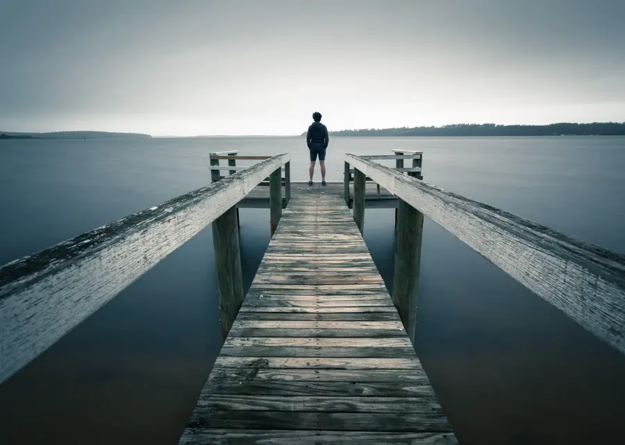
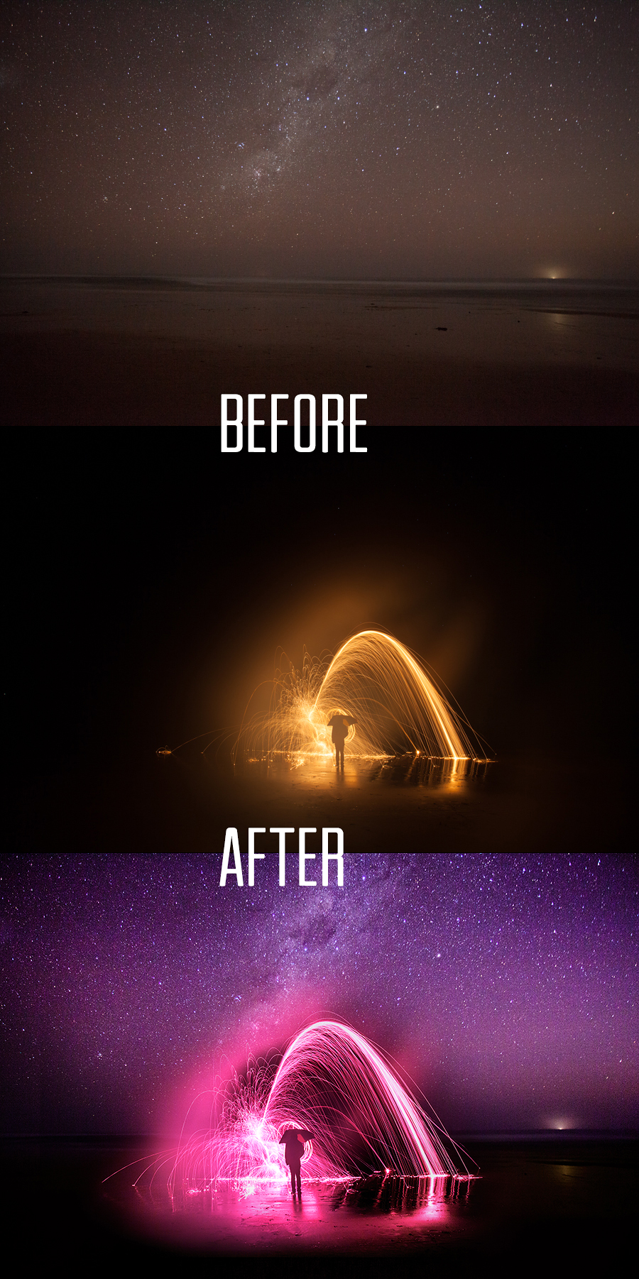
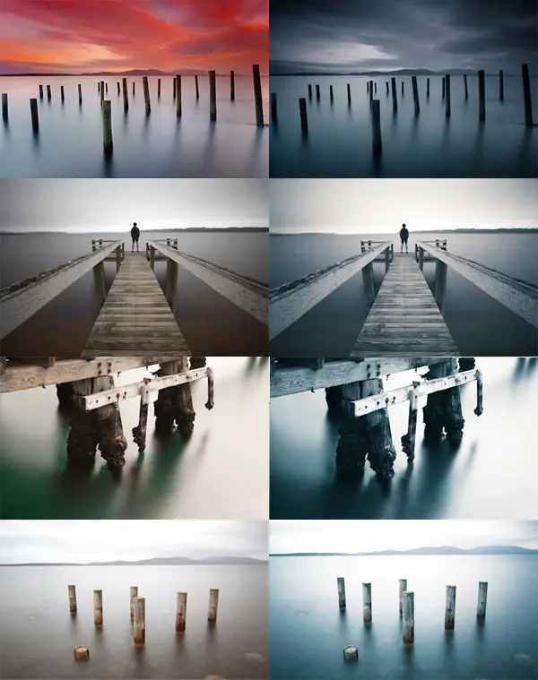
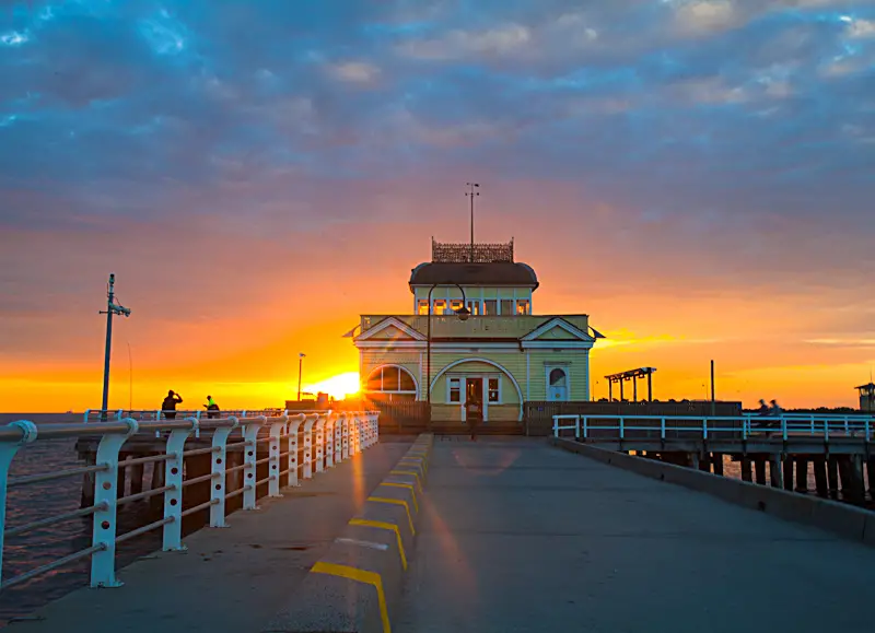
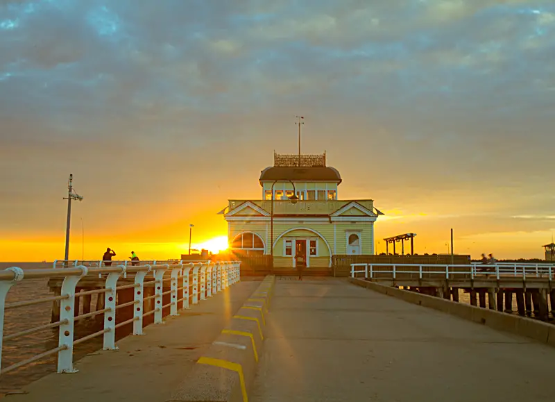
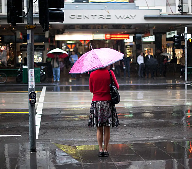
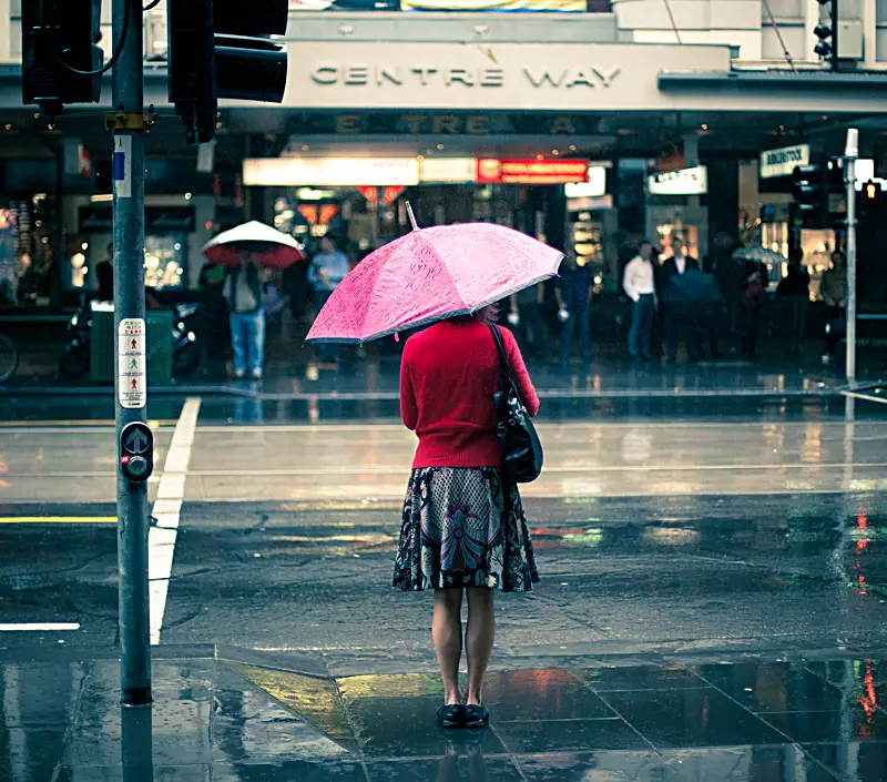
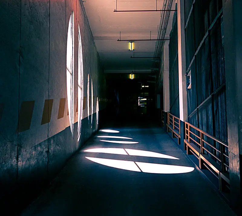
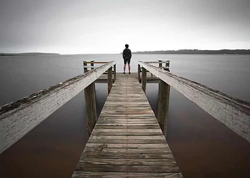
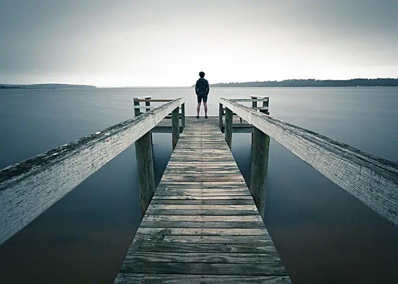
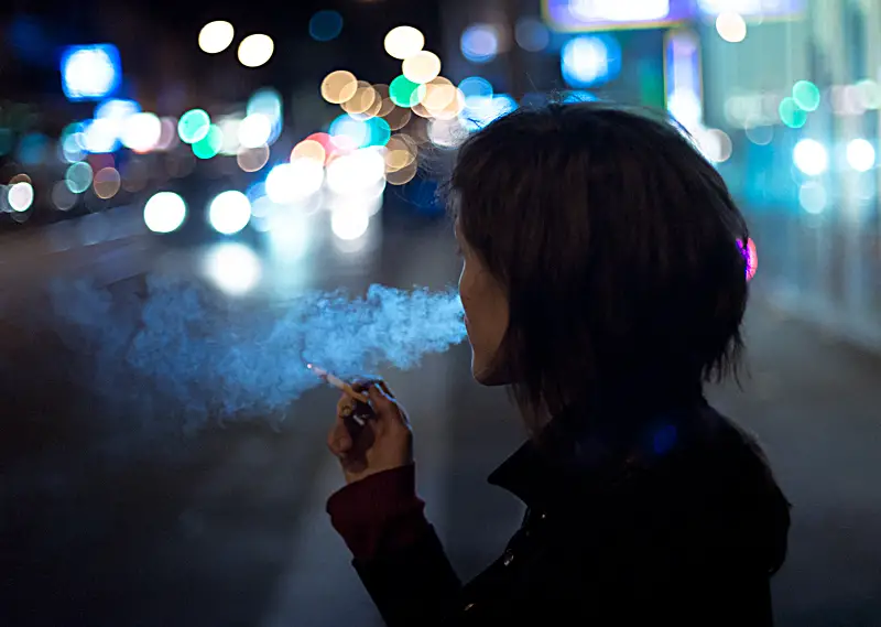
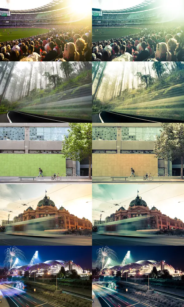
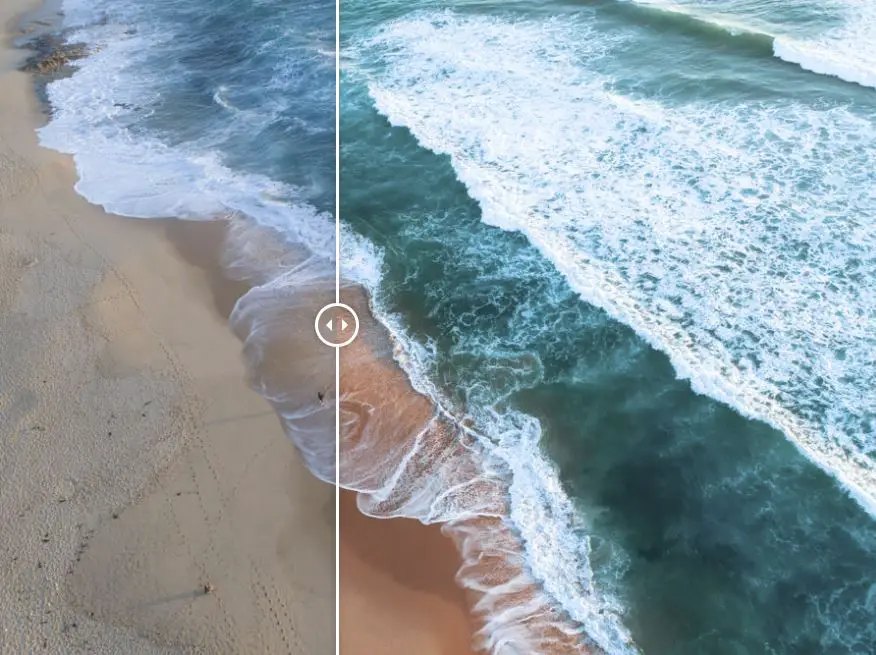
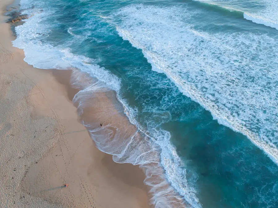
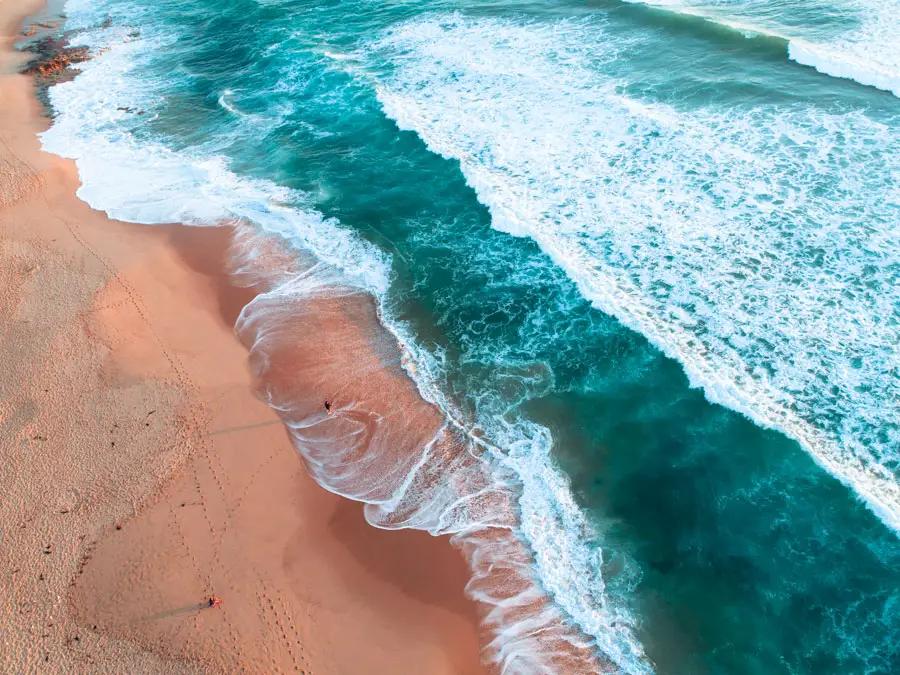
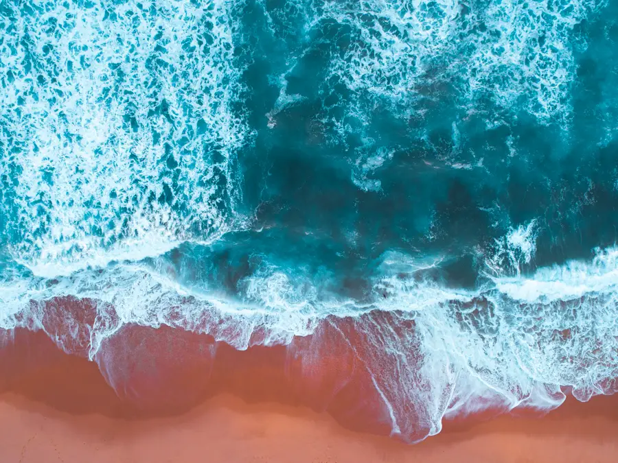
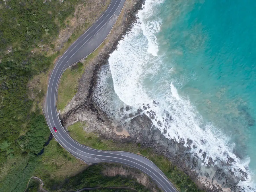
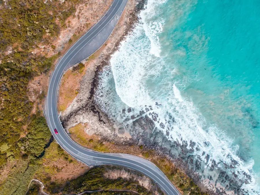
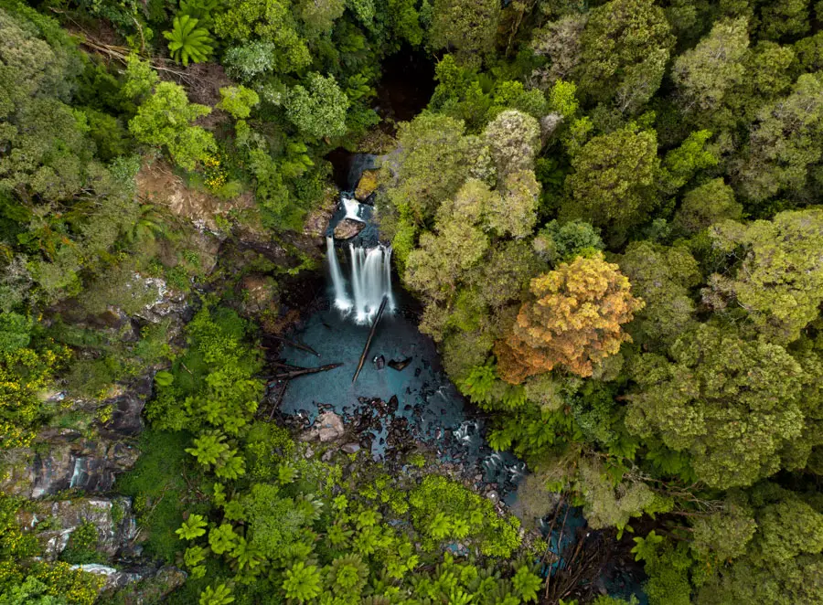
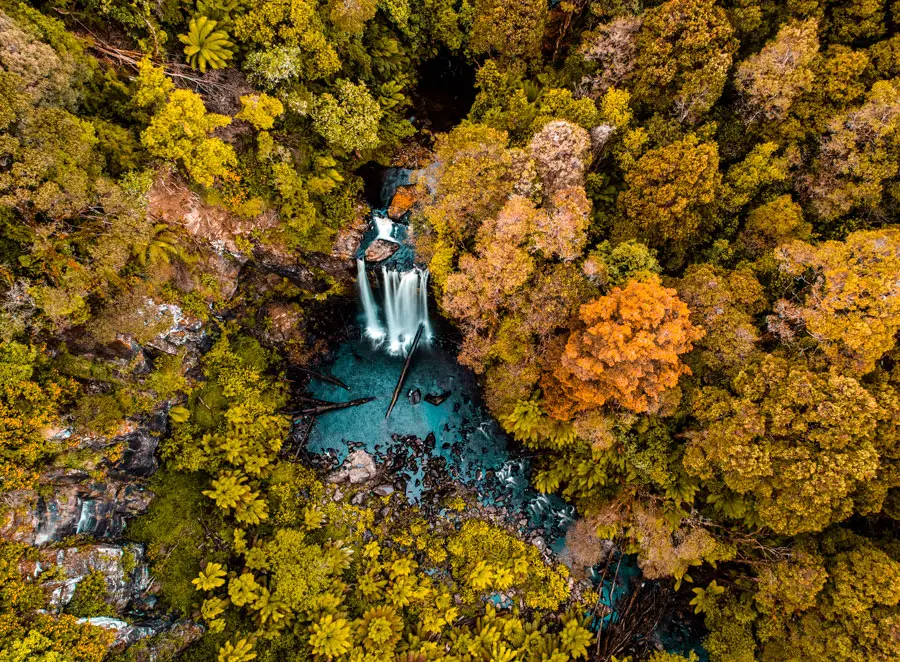
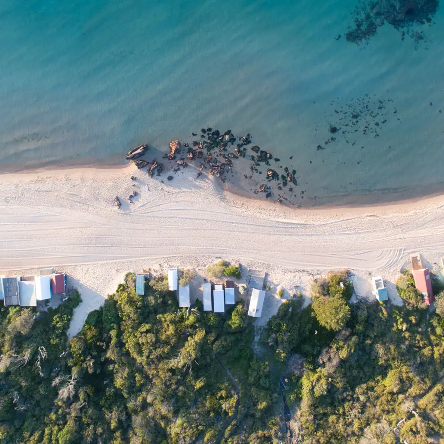
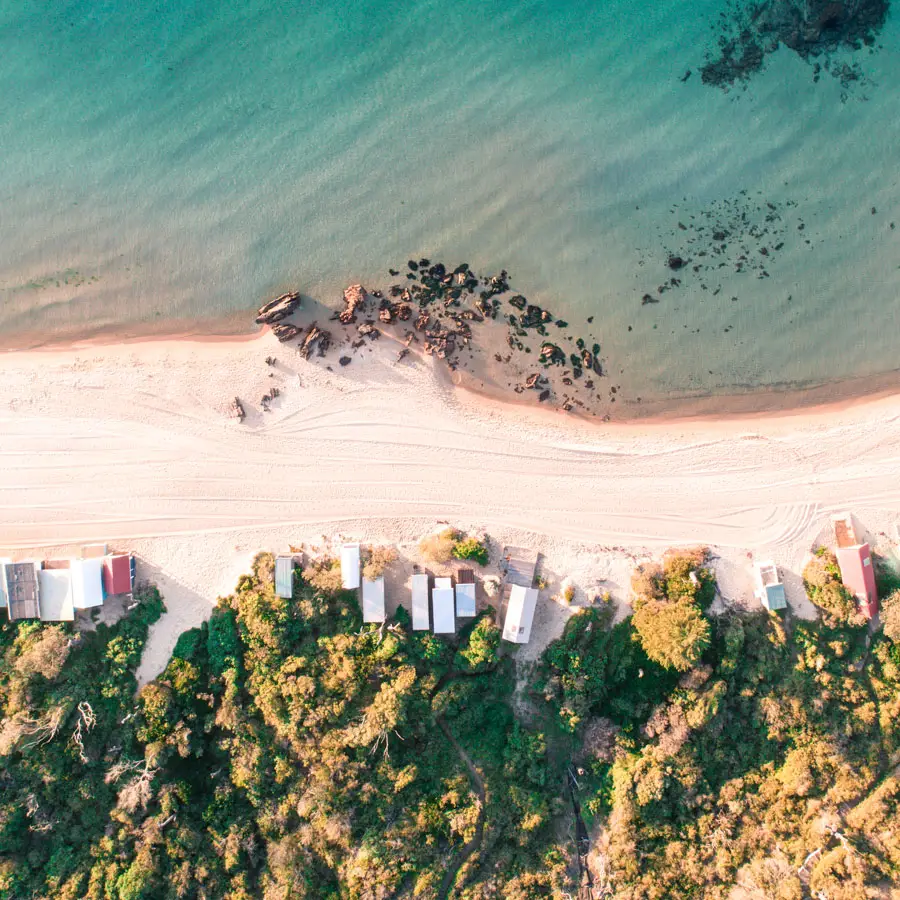
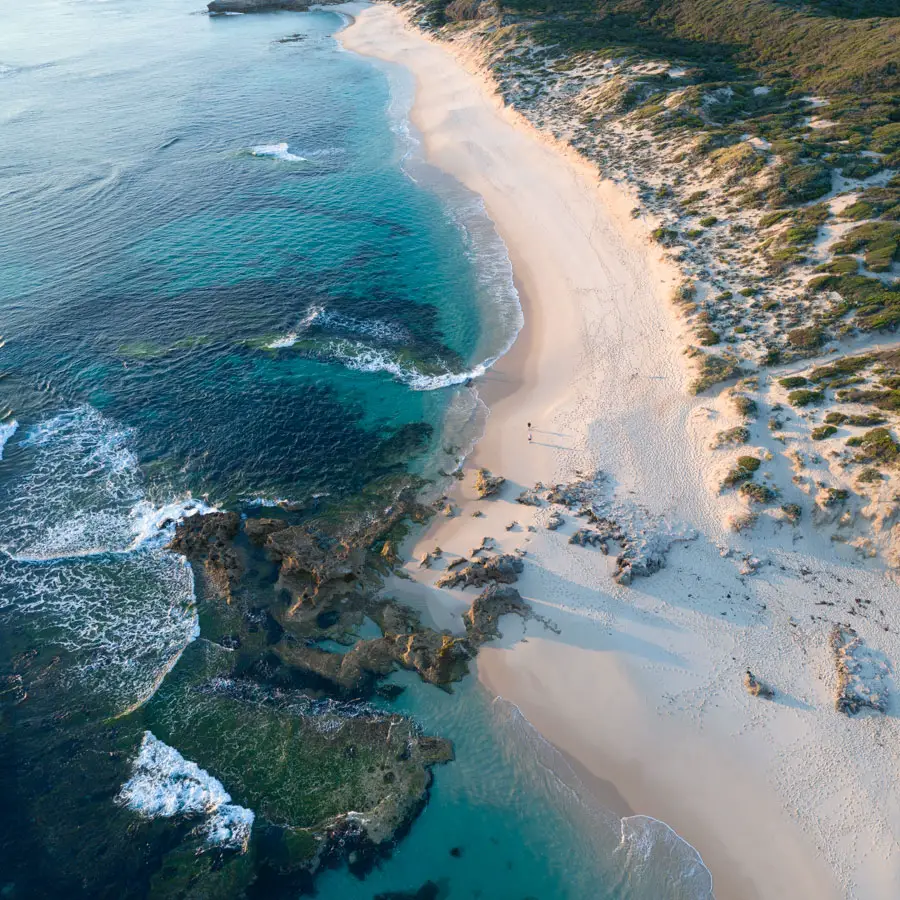
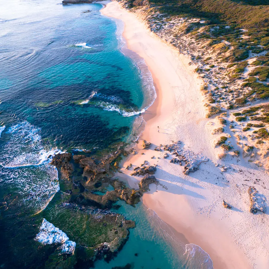
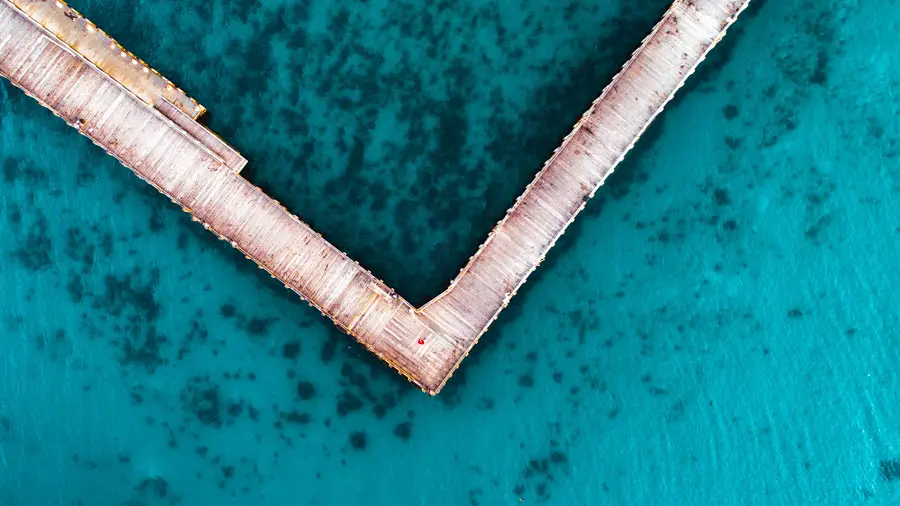
Now I’m more of a visual person so now for some before and after shots of these Lightroom drone presets:
[twentytwenty]
[/twentytwenty]
[twentytwenty]

[/twentytwenty]
[twentytwenty]
 [/twentytwenty]
[twentytwenty]
[/twentytwenty]
[twentytwenty]
 [/twentytwenty]
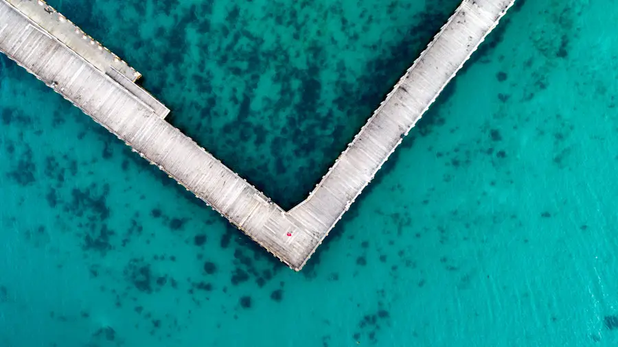
 [/twentytwenty]
Download
Please use this link to download these free Lightroom presets for drone photography.
Installation Instructions
How to install on Lightroom Windows
- Open Lightroom
- Select Edit > Preferences > Presets
- Select the box ‘Show Lightroom Presets Folder’
- Double click on Lightroom
- Open Developer Presets
- Copy the folder (Alex Wise – Drone Presets) into the Develop Presets folder
- Restart Lightroom
How to install on Lightroom Mac
- Open Lightroom
- Select Lightroom > Preferences > Presets
- Select the box ‘Show Lightroom Presets Folder’
- Double click on Lightroom
- Open Develop Presets
- Copy the folder (Alex Wise – Drone Presets) into the Develop Presets folder
- Restart Lightroom
Thanks
If you have any questions on using the presets or feedback, please don’t hesitate to use the contact section to get in touch.
Don’t forget about me when you’re at the top! 😉
– Alex