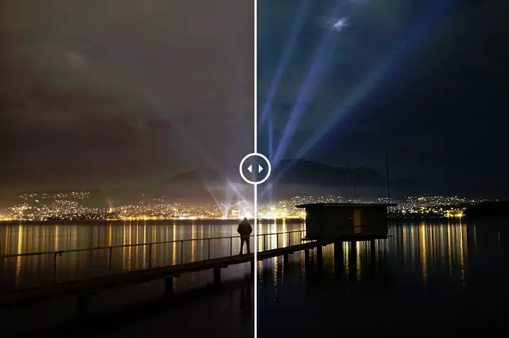
Following up from my recent post sharing photos of [ilink url=”https://www.alexwisephotography.net/blog/2014/08/22/a-quick-weekend-in-tasmania/”]a quick weekend photographing parts of Tasmania,[/ilink] I shared a photo from Dark Mofo 2014 and thought it was good timing to share a before and after of how the image came together.
[twentytwenty]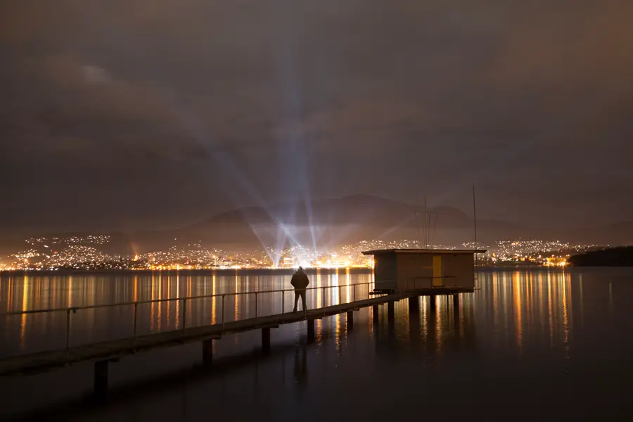
 [/twentytwenty]
Capturing and Processing Dark Mofo 2014
This forms part of a [ilink url=”https://www.alexwisephotography.net/blog/category/technique/before-and-after-technique/”]Before and After Series[/ilink] where I share both the before and after images and do my best to provide an explanation of how the images were captured and processed. I’m not one to heavily process my images but when I can’t capture what I see, I will resort to using Photoshop and multiple layers to achieve what I visualised before even pressing the shutter. Perhaps some may feel that this is cheating and I appreciate that this level of post processing isn’t to everyone’s tastes but I would argue that post processing like this remains within an acceptable level of photography post processing and does not cross over to photo manipulation. The later involves adding skies, moons or sunbursts from other shoots where the lines of an acceptable level of Photoshop starts to be questioned. But let’s move on to how this particular image was captured and post processed.
Capturing the Images
Some background about this years Dark Mofo
This year Dark Mofo had an installation of multiple lights scattered around the city of Hobart where the general public could go and control them for a few minutes. Last year the organisers of Dark Mofo had a one light installation which was centered in the city of Hobart – making things a bit more easier for photographers. This great image of Dark Mofo 2012 by Ben Short captures it in all its glory.
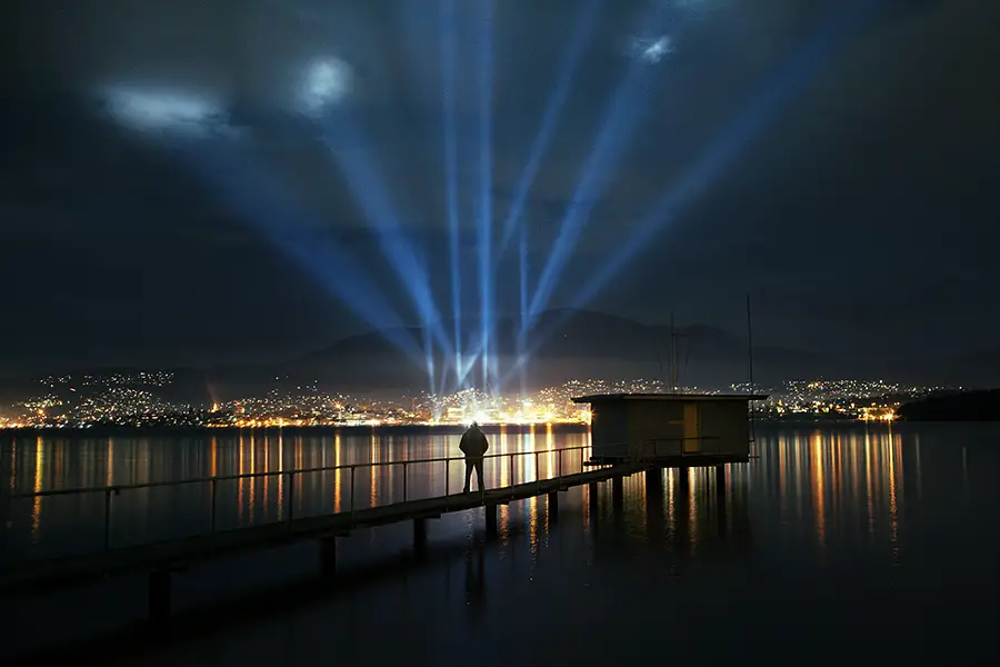
With the lights being controlled manually, imagine a kid dialed up on red cordial controlling the lights and them quickly moving around the sky (in case you’re curious I recorded this admittedly terrible video of two of the installations doing their thing). Rather than take a photo close up of the installation I looked for somewhere out of the city which would provide me with a viewpoint that captured all of the lights located around Hobart. For this reason I chose Bellerive which provided a direct view from across the river looking towards the city and the Dark Mofo light installations. After standing and watching the lights flicker around the sky I knew straight away that I would need to capture multiple exposures of the lights and combine them in Photoshop if I was to get the result I was after.
Capturing the light installation
Setting up for the image I decided to use my [ilink url=”http://www.adorama.com/ICA5DM2.html?KBID=65353″ style=”note”]Canon 5D Mark II[/ilink] , [ilink url=”http://www.adorama.com/CA2470.html?KBID=65353″ style=”note”]Canon 24-70 2.8 L[/ilink] , tripod and interval remote for the photo. Composing the image I used the jetty with me standing on it in the foreground and the Dark Mofo lights in the background. This would require multiple images to be captured of the light installations (to capture them at the different points in the sky) and then another shot of me standing on the jetty.
Capturing the light bursts I wanted to capture shorter exposure times so ramped up my ISO to 2000 and set my camera to aperture priority mode and shot at F/2.8 which resulted in an exposure time of around 0.5″ of a second. I set the camera to burst mode and fired around 15 shots of the lights. These would later be selectively combined to form the top part of the image
Capturing the image of me standing on the jetty
For the image of me standing on the jetty, I changed my camera settings to manual and set the ISO to 200, aperture to F/4 and an exposure time of 15 seconds. Using the interval remote, I was able to set the count down timer to be one minute, giving me plenty of time to get down to the jetty and stand ready for the photo to capture. The reason I used a longer exposure (15 seconds) was to smooth the water of the bottom part of the image. I found the shorter (0.5 second) exposures were leaving the water a little choppy from the outgoing tides and by capturing a longer exposure time this would also capture more reflection of the light installation.
Post Processing the Images
The final image was composed of 8 images and various saturation, curves and contrast adjustments (using Niksoft ProContrast and Viveza for the later). The image below gives you a sense of how rapidly the lights were moving based on the exposures that were captured. Note the exposure time was 0.5″ of a second so the 10 blue temperature photos you see were taken over the space of around 40 seconds. Quite a lot of movement!
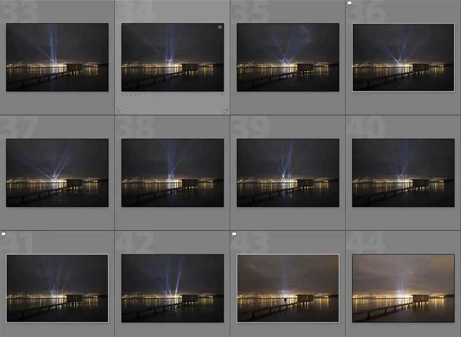
Once I’d loaded the images up into Lightroom I exported them as full JPG and loaded them into Photoshop. Here I used one of 0.5″ second exposure images as the base image and then added the other images (including the one of me standing on the jetty) as layers. The idea here was to selectively mask myself and different parts of the light installation into the base image by using layer masks.
[box]Haven’t used Photoshop Layer Masks before? Check out this tutorial on using Layer Masks that should bring you up to speed.[/box]
Using layer masks on each light layer, I selectively introduced parts of the light into the base image and also masked myself standing on the jetty into the shot. Once this was done, I set about using some curves masks to play with the red, green and blue colour channels to make some subtle changes to the colour of the image. Lately I’ve become quite the fan of the Pro Contrast Tool and Viveza that forms part of the [ilink url=”https://www.google.com/nikcollection/”]Nik Collection[/ilink]. I’ll generally use one of each and then play with the opacity of the layer. For this specific image though, I used a Pro Contrast layer just on the light beams of the shot to give them a bit more punch.
The above is a little confusing so to help explain things a little better I’ve put together a small clip that starts at the base image and enables each individual layer showing the progression and processing of the images.
Hopefully the clip provided some clarification regarding how the different layers were used and the subtle changes which using curves and ProContrast had on the image. If you have any questions about the process or the image itself be sure to leave a comment or drop an email and I’d be happy to help.
Thanks for reading,
– Alex