
My first post for 2014! Hard to believe that January is almost over. This year I wanted to share some behind the scenes before/after photos to give you an idea of how some of my photos look in camera and the process I follow to edit them. Starting the series with this photo from Cape Woolamai on a moody sunset.
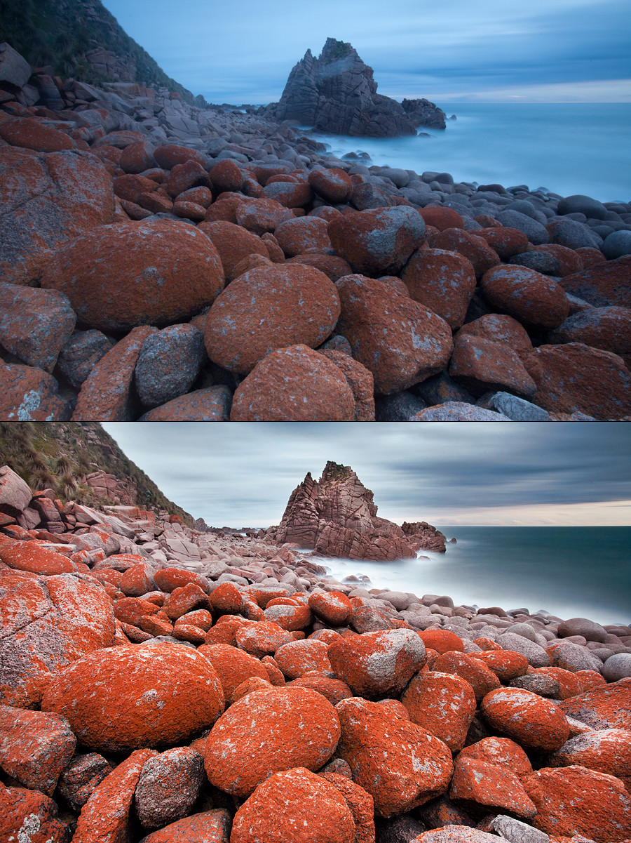
This is a photo I took a couple of years ago now at Cape Woolamai which is situated along the stunning Phillip Island coastline. I had an idea in my head of how I wanted a photo to look of the scene which captured the stunning orange lichen rocks while using the giant rock as a backdrop with a long exposure to capture the blur of the clouds and water. To capture the image I used a Canon 5D Mark II, Canon 17-40, B+W 110 and Cokin Z-Pro graduated neutral density filter.
The original shot came out quite flat and had its flaws that required some tinkering in Lightroom and Photoshop to get right. Here are the steps that I followed to get the image to its final state. Before you read, you might want to watch a video I prepared earlier that goes over using Curves in Photoshop 5. I apologise that it may be a bit long winded and confusing at times but feel free to send an email if you have an queries but basically the general jist of the editing went something like:
- I always shoot my images with auto white balance and find towards the end of a sunset, the camera will often go for a colder lower colour temperature which results in a blue to your image. To correct this I boosted the temperature to warm the colours slightly. It was important at this stage not to increase the temperature too much as I wanted to retain the blue of the water. Normally I make most of my changes in Lightroom and that’s it but for this image I wanted to tinker quite a bit with the colours so exported to Photoshop
- Once in Photoshop I had to remove the gaping gash that formed across the rock. It turned out that my graduated neutral density filter had got scratched in my bag (something had managed to dig through the case and scratch the filter – bummer). I didn’t realise I had scratched the filter until I got home so thought the whole trip had been a waste of time. Fortunately though, I was able to use the cloning tool to and slowly remove the scratch from the rock
- At this stage the image was looking quite flat still so I created a Curves layer which would be the first of many curves layers used over the course of the editing process. Curves are amazing and something I’ve talked about in the past but just to quickly remind you, they allow you to make selective adjustments to the red, blue and green channels of the highlights, mid tones and shadows of an image. At this stage I’ll make a general adjustment to the overall image and then make more selective adjustments later on through the use of layer masks
- For the image, I wanted to selectively bump up the highlights of the water to make them appear more brighter while darkening the clouds to make them appear moody. To do this I used a Curves layer once again but this time introduced a layer mask. By using layer masks, you can paint over areas where you only wish to make an adjustment. For example, if I’m only wishing to adjust the tones of the sky I would use a layer mask and paint over that area which then means any changes you make in Curves will only be to that specific area which you painted over. The same principal applies for when making adjustments to the water of the photo. Through using this method I’m able to selectively bump up parts of the image without blowing out the rest of the image. Following this technique I used the primary channel and increased the midtones and highlights of the water and decreased the shadows, midtones and highlights of the sky to create some mood.
- When editing the sky it was important not to accidentally darken the surrounding cliff and rocks in the area. To avoid this, I used the feather tool and selected the sky using this tool. Initially when I first started using Photoshop, I was hopeless with the feather tool and it really took some practicing until I got the hang of it. So if you’re struggling, don’t give up and possibly look at some tutorials on YouTube to get a sense of how others use it. It’s a great tool but at the same time, quite painful and difficult when you’re unfamiliar with it
- As the exposure of the water was now bright and the sky was dark, I had to balance the exposure of the rock area so created another layer mask to selectively adjust this area to balance it against the rest of the scene by using curves with some minor dodging and burning
- Once I was happy with the exposure of the overall scene, I was once again in curves making adjustments to the different colour channels (red, green and blue). Basically the reason for this is that I wanted to play with the blue channel a bit selectively around the water to make it appear more blue and also reduce the colour cast introduced by using filters. I find using the RGB channels in Curves a great and quick way to colour correct your image to fix any issues like colour cast
- Final adjustments to the image was a resize for web (800×600) and sharpened using ultra sharpen mask
I hope this makes sense and gives some insight into how the final image was reached. For me the most important thing is to go in with an idea of how you want the image to look in your head and work according to that (something that is easier said than done).
Thanks for reading,
Alex
